Category: Watercolour

RHS Companion to Scented Gardens

Posted by November 17, 2014

These are garden plans I painted for the recently published RHS Companion to Scented Gardens by Stephen Lacey. I was given the layout and plant names and then maxed out my Pinterest saving pictures of each one to refer back to.   I enjoyed this job – orderliness and plants, a satisfying combination for a control-freak nature lover like myself.

gravel garden..

Gravel Garden Illustration_2

mixed border..

Mixed Border Garden Illustration_2

shady garden..

Shady Garden Illustration_2

and sunny garden.

Sunny Garden Illustration_2

Scented gardens photo 2_

Scented gardens photo_

A home in Kent

Posted by November 7, 2013

I finished this commission a few weeks ago – it’s a similar idea to the picture of Ringmer Park.  I’ve put my illustration work on hold for the moment while I concentrate on storyboarding, but I wanted to stick it up anyway.  It’s a watercolour with the odd bit of gouache – the space is where the name of the house was (I’ve removed it for privacy reasons).

Click to view larger!

Stowting pic for blog_

Mawiage

Posted by May 31, 2013

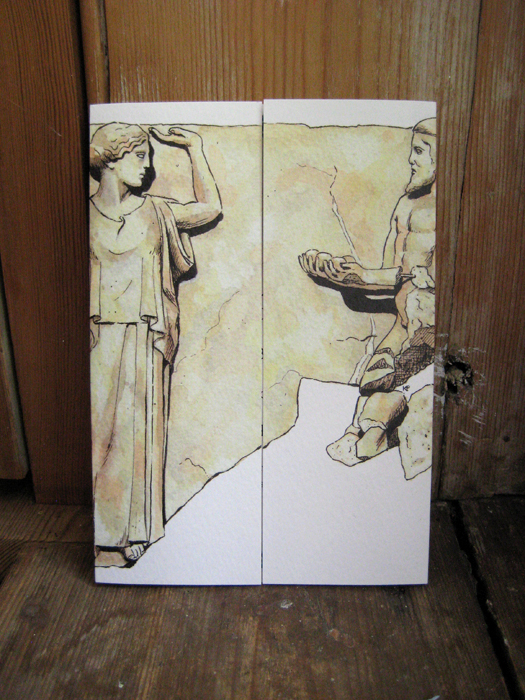
I got married in March, so I decided to design the invitations.  Our first venue was going to be a Greek restaurant, and I have a lot of love for Greece having studied there for many months.  After some research I took this metope from the Temple of Zeus at Olympia..

TC-Herc-Hesperides-Metope

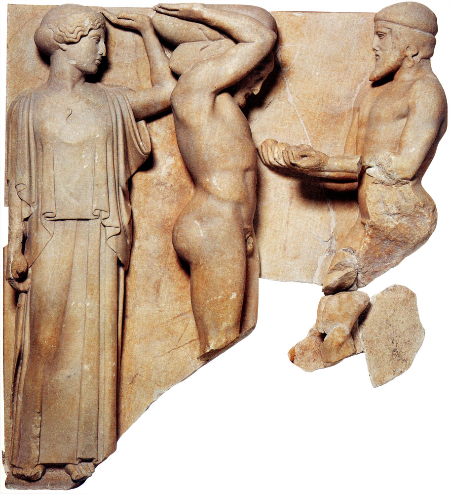
.. and took out Heracles, leaving Athena and Atlas.  I painted this..

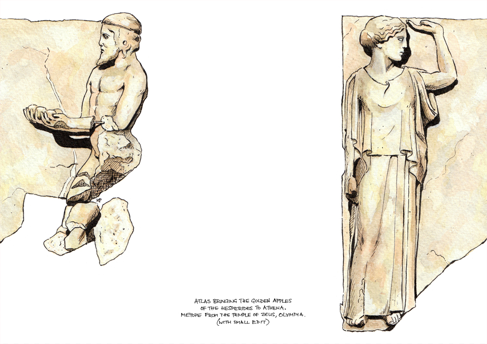
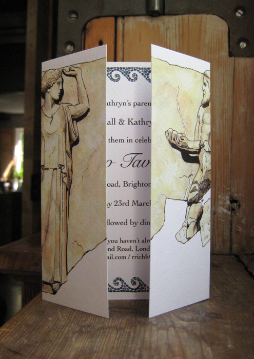
..and got it printed up with a gatefold design, which once back from the printers looked like this:

invite_ closed invite_

The ceremony itself was at the Royal Pavilion in Brighton, so I painted this as well (it’s a view of the Pavilion)..

DL_LANDSCAPE

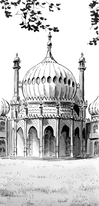
.. and included it in the mail-out.  The ceremony invitation was on the other side with a dragon, which I copied from the wallpaper in the room where we were to marry..

DL_LANDSCAPE

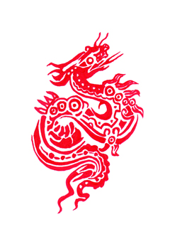
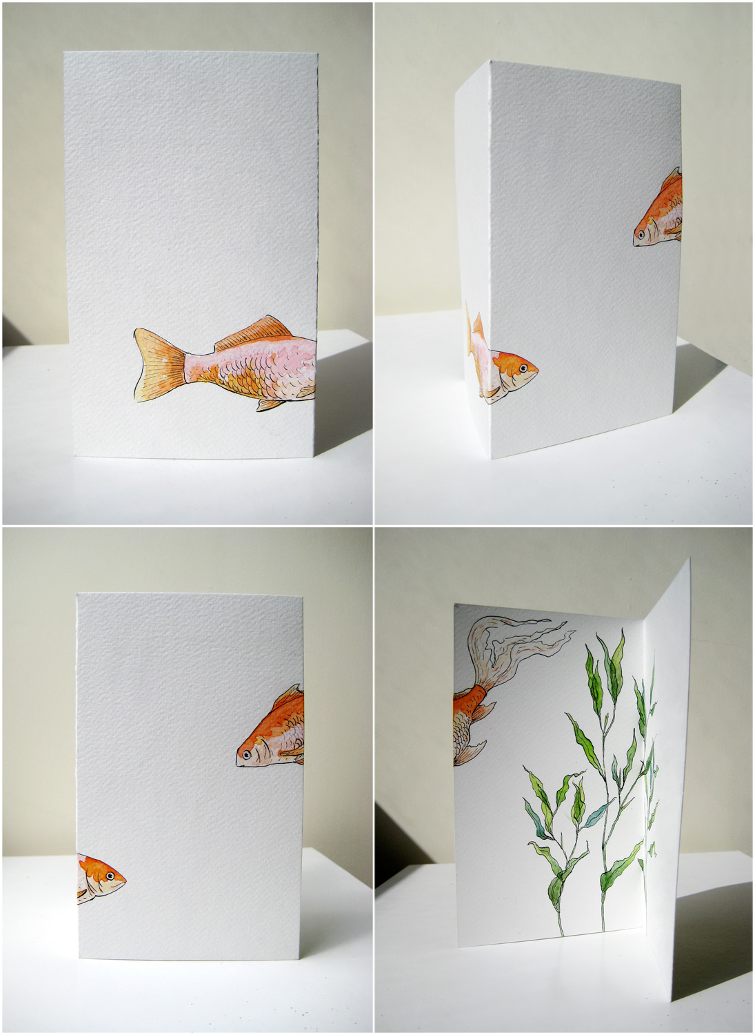
.. I like my dragon.  Anyway having done all that, the venue fell through with 3 weeks to go, so in a hurry we got these cards printed up for a 2nd mail-out –

A6_PORTRAIT_GREETING_CARD copy

– and had an amazing time at a restaurant overlooking the pier instead.  To be honest it was worth it though, any excuse to draw ancient greek people.

Bolinda Vale roughs

Posted by May 16, 2012

Some roughs for the watercolour landscape of a few posts back (see it here).  Because this project was quite a learning curve, I took several roughs nearly to completion to check my methods were working!  Click on the pictures to view them bigger.


Big fish & Little fish

Posted by February 28, 2011

I posted this card when I first began this blog, which was also before I had Photoshop, so it wasn’t the best quality image.  I wanted to improve on that and tidy it all up a bit, as I quite like it and wanted to add it to my Illustration page.  Little Fish is sadly no longer with us, but Big Fish is still going strong and is having some crazy times on my website’s front page.  You can view the card much closer by clicking on it and then clicking again to zoom in.


Bedecked lamp

Posted by January 28, 2011

I have a bit of a thing for Parker Quink ink.  It separates out into bluey greys and yellows when you use it diluted as paint, an effect I quite like.

Glorious gardens

Posted by January 25, 2011

Ok so this is the big project I had on before Christmas.  My client has a beautiful garden by the South Downs in Sussex which he opens to the public in the summer.  He gives his visitors a print-out of information about the garden but wanted to accompany this with a aerial plan.  So my brief was to design such a picture – something simple and clear, with a key.  The below is the result, drawn in ink and cleaned up in Photoshop. The map was to be printed out on a side of A4 paper, so I drew the original slightly bigger at approximately 23cm x 32cm; this way you can get more detail in with crisper lines.  Click on the image to enlarge.

Ringmer B&W Garden Plan

The second half of the commission was the same plan but in colour and with little illustrations around it of the highlights of the garden.  This version was to be framed for inside the house.  I used ink and watercolour for this, on lovely 100% cotton Fabriano paper, so it will stand the test of time.  The dimensions are approximately 35cm x 53cm.  A frame is the final element for a picture like this, to group the images together in their composition.  Click on the image to enlarge.  I should add that there are some lovely blue skies in the little illustrations which the scan hasn’t picked up very well.

Ringmer colour plan 2012_

Hungry Hyacinths

Posted by January 18, 2011

It’s a bit of a mess but what the heck.  I was getting increasingly hungry while drawing/painting it and consequently sped up as I went along.  I will do an improved Version II when the bulbs are in bloom.  Spring seems to suddenly be here and it’s filling the flat with light and the garden, slowly, with flowers.

Dexter & Teasel

Posted by August 3, 2010

This is a watercolour I did just before we went to South America.  My cousin commissioned me to paint her (engaged) friend’s two labradors; she and her girlfriends were then going to give it to her as a surprise wedding present.  The wedding was this weekend, the painting was a success, so at last I can post it here!  Painting black, glossy dogs with watercolours is, I assure you, a challenge.  However it was a lot of fun, and hopefully I got some way to resolving the issues.

a London summer

Posted by July 27, 2010

We’re back in London, moving in to our new place and not posting enough on here.  We now live on a park so lots of opportunities for figure studies.. Also below, a visit to the British Museum, one of my favourite places.  On this occasion I went to see the Italian Renaissance Drawings exhibition, stuffed with gorgeous sketches and half the population of London.

This was the final drawing in the exhibition, Portrait of a young woman in profile to the right by Titian.  Artists at that time tended to use men as models for female characters, I guess because nude female models weren’t the done thing.  So the women often looked a little (or a lot) masculine.  But not in this drawing.  You really need to stand in front of it to see – it’s lovely.