Category: Illustration

RHS Companion to Scented Gardens

Posted by November 17, 2014

These are garden plans I painted for the recently published RHS Companion to Scented Gardens by Stephen Lacey. I was given the layout and plant names and then maxed out my Pinterest saving pictures of each one to refer back to.   I enjoyed this job – orderliness and plants, a satisfying combination for a control-freak nature lover like myself.

gravel garden..

Gravel Garden Illustration_2

mixed border..

Mixed Border Garden Illustration_2

shady garden..

Shady Garden Illustration_2

and sunny garden.

Sunny Garden Illustration_2

Scented gardens photo 2_

Scented gardens photo_

Japanese Zen Gardens

Posted by April 10, 2014

One of the illustrations (well they’re plans really) for the book Japanese Zen Gardens by Yoko Kawaguchi which has just come out.  It was a lovely book to research, spending my time looking at photos of these beautiful and ancient creations.  I would love to see them for myself one day; some aren’t even open to the public.  She was a lucky lady getting to go inside.

This is one is Daisen-In in Kyoto.

Daisen-in_


A home in Kent

Posted by November 7, 2013

I finished this commission a few weeks ago – it’s a similar idea to the picture of Ringmer Park.  I’ve put my illustration work on hold for the moment while I concentrate on storyboarding, but I wanted to stick it up anyway.  It’s a watercolour with the odd bit of gouache – the space is where the name of the house was (I’ve removed it for privacy reasons).

Click to view larger!

Stowting pic for blog_

Mawiage

Posted by May 31, 2013

I got married in March, so I decided to design the invitations.  Our first venue was going to be a Greek restaurant, and I have a lot of love for Greece having studied there for many months.  After some research I took this metope from the Temple of Zeus at Olympia..

TC-Herc-Hesperides-Metope

.. and took out Heracles, leaving Athena and Atlas.  I painted this..

..and got it printed up with a gatefold design, which once back from the printers looked like this:

invite_ closed invite_

The ceremony itself was at the Royal Pavilion in Brighton, so I painted this as well (it’s a view of the Pavilion)..

DL_LANDSCAPE

.. and included it in the mail-out.  The ceremony invitation was on the other side with a dragon, which I copied from the wallpaper in the room where we were to marry..

DL_LANDSCAPE

.. I like my dragon.  Anyway having done all that, the venue fell through with 3 weeks to go, so in a hurry we got these cards printed up for a 2nd mail-out –

A6_PORTRAIT_GREETING_CARD copy

– and had an amazing time at a restaurant overlooking the pier instead.  To be honest it was worth it though, any excuse to draw ancient greek people.

Funny Peculiar

Posted by November 7, 2012

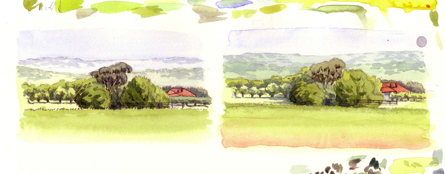
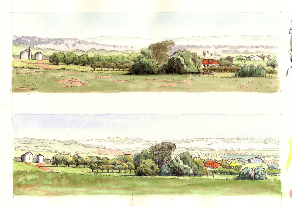
Hello!  At last I can post some of the illustrations I was doing over the summer for Funny Peculiar, Will Young’s autobiography.  He gave me the chapters as he wrote them and I went through thinking up ideas, 2 per chapter. It was so much fun; the book is v amusing (as you’d expect) but sad too in parts, which I tried to reflect.  We were going for a whimsical, stripped back look, though I did sneak in a bit of cross-hatching here and there. Other excitements have been an extract (including pics) being featured in Attitude magazine, and, wait for it, Eamonn Holmes doing THIS:

Anyway here are a couple of pictures….

Will talks in one chapter about how even once he’d come out, he was still being offered ideas for videos where he’s walking down a beach with a woman, Backstreet Boys-style.  Crazy.

Smith, the champion belly-flopper of Will’s prep school, preparing for his high dive.

Will talks about his depression in the book.. this picture is about the struggle to get up and meet the day.

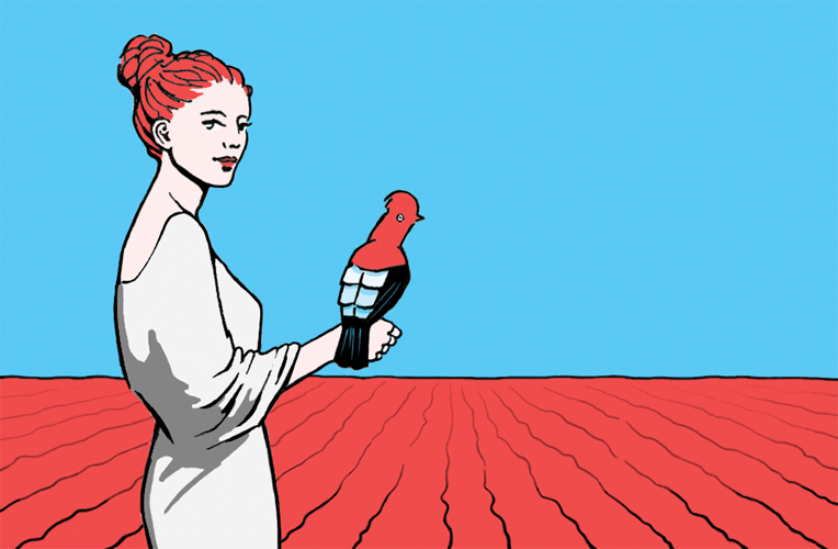
This silly bird is my favourite.  It heads up the last chapter (involving the death of a pigeon) and it happens near me, so it’s a Hackney pigeon on a Hackney tree.  Of course pigeons go to heaven too.

I think it’s brilliant, and speaks volumes, that Will wanted to do this instead of the usual photo insert.  It was a fantastic project to work on and I’m so grateful to him for the opportunity.

At all good book stores now!  (Waterstones/Amazon)

A flotilla of hats

Posted by August 3, 2012

According to this.  Practising one of the pics for the project I’m working on at the mo.

Bolinda Vale roughs

Posted by May 16, 2012

Some roughs for the watercolour landscape of a few posts back (see it here).  Because this project was quite a learning curve, I took several roughs nearly to completion to check my methods were working!  Click on the pictures to view them bigger.


Bolinda Vale

Posted by May 8, 2012

A friend commissioned me to paint this watercolour recently as a present for her in-laws; it’s of their farm in Australia.  This was actually one of the hardest jobs I’ve had; it may look simple but watercolours are a lifetime’s learning so there were a few trial runs!  I often use them but this was the first time as the primary medium (as opposed to the drawing being the focus); also there was a challenge in keeping the definition and features of a landscape that’s set into the distance.

The picture was drawn with diluted waterproof black ink and the dimensions are 7 x 23.5cm.  I find scanning doesn’t pick up the paler washes of my watercolours, I’m going to look into how to improve on that.  Having said that, I quite like that the transparency and delicacy of the medium is a bit beyond a clunky digitising machine.

Click on the image to see it bigger.

NB – you can see the roughs for this painting on my later post here.

Business card finally materialises

Posted by May 1, 2012

I’ve spent rather too long working on my business cards.  I had an idea which was never right, but I kept working at it like throwing good money after bad.  Eventually in despair I scrapped the whole thing and started over, with a better idea which meant it all happened much faster.

Here’s one side:

And here’s the other:

It’s not quite as random as it might appear.  I wanted a person in it – they’re the prominent feature in most storyboards and my favourite thing to draw – and an animal because they’re important to me.  The bird is a Cock-of-the-rock, which is a daft but beautiful species I got quite attached to in Peru.  I wanted a sequence to take place over the two sides, partly because it was possible (by using moo) and partly because it would fit with the storyboarding theme.  There are a few tweaks I’ll make for the next batch, but for now this idea can stay.

Unity House

Posted by July 5, 2011

This is a commission I did about 2 weeks ago for a friend.  It’s of a venue in Jamaica called Unity House where another friend of hers was married; she thought she’d give the couple this as their wedding present.  It’s drawn in ink and wash and at her request I gave it a torn edge.